Wegovy
Designing A New Experience For Change Seekers
Executive Summary
Brand
Wegovy (Novo nordisk)
Role
UX Director
The Project
I led the ground-up rebuild of Wegovy.com, directing UX strategy, content architecture, and client relationships across a five-month engagement. Working alongside a UI Director, content strategists, and copywriters, I owned the experience vision from kickoff through launch—facilitating workshops, leading wireframe development, and serving as the primary point of contact for stakeholder communication and developer support during the AEM build.
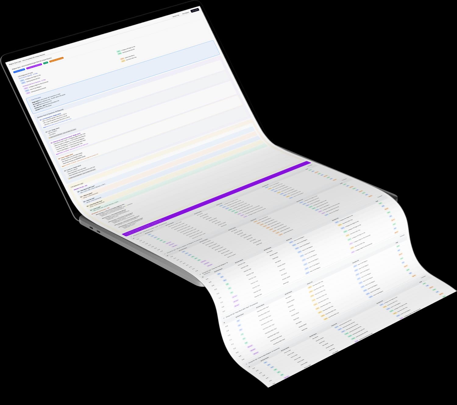
This project also marked a milestone in how I leverage AI as a design tool, using ChatGPT, Claude, and Figma Make to architect a wayfinding quiz with 45 unique outcome combinations.
The Problem
The existing Wegovy site had two fundamental issues:
It wasn't accessible.
Text embedded in images, insufficient contrast, interaction patterns that failed basic compliance standards. For a medication serving patients managing serious health conditions, this wasn't just a legal risk—it was a failure of care.
It was too "pharma."
The old site read like a clinical document. It presented Wegovy as a prescription rather than what it actually is: a life-changing medication. Weight-loss drugs have shifted culturally. Patients aren't just filling prescriptions—they're making significant decisions about their health, their bodies, and their futures. The experience needed to honor that.
The site didn't guide users through their journey. It dumped information and hoped they'd figure it out.
Strategic Reframe
We rebuilt the experience around a consumer journey, not a product spec sheet.
Two primary audiences:
Adults considering Wegovy for weight loss or cardiovascular risk reduction
Caregivers of adolescents exploring Wegovy for weight management
Both groups needed the same thing: confidence. Confidence that Wegovy was right for them, that they could access it, that they could afford it, and that they'd know what to do once they started.
We mapped the experience to four journey stages:
Is Wegovy Right for Me — Education and eligibility
How Do I Get It — Prescription pathways
What Will I Pay — Cost, insurance, savings programs
Getting Started — Onboarding and expectations
Every design decision filtered through these stages. If a page or component didn't serve one of them, we questioned whether it belonged.
The Wayfinding Quiz
Users don't always know where they are in their journey. Some arrive curious but uncommitted. Others have a prescription in hand and need savings card information. The old site treated everyone the same.
I designed a wayfinding quiz to meet users where they are and point them where they need to go.
Five questions. 45 unique CTA combinations.
Based on user responses, the quiz generates two tailored calls-to-action directing them to the most relevant next step in their journey. Someone still researching gets pointed toward eligibility content. Someone ready to fill a prescription gets sent to NovoCare Pharmacy.
Built with AI.
I used ChatGPT and Claude to architect the selection matrix—mapping every possible answer combination to appropriate outcomes. Figma Make helped prototype the interaction. The result was a complete logic framework that I handed to the authoring team, giving them everything they needed to build the quiz perfectly in AEM.
The client's reaction? Overwhelmingly positive. AI didn't replace the thinking—it accelerated it. What could have taken weeks of manual logic mapping happened in days, with cleaner documentation than traditional approaches typically produce.
Accessibility Leadership
I championed accessibility throughout the project. This wasn't a compliance checkbox at the end—it was a design principle from day one.
We eliminated text-on-image patterns that plagued the old site. We established contrast standards, focus states, and interaction patterns that met WCAG guidelines. Every component was evaluated for screen reader compatibility and keyboard navigation.
For a medication that serves patients across age ranges, ability levels, and health conditions, accessibility isn't optional. It's respect.
Design System Implementation
This project marked the first implementation of a new Novo Nordisk design system within the Wegovy brand. The system was built to scale—token-based architecture means sister brands (Ozempic, Rybelsus, and future products) can inherit the same components with adjusted colorways and brand-specific styling.
We weren't just building a website. We were lighting the path for every Novo Nordisk consumer brand that follows.
Client Partnership
The relationship I built with the primary stakeholder became the foundation for everything we accomplished.
Workshops created common ground. Early collaborative sessions—aligning on journey mapping, content priorities, and design direction—established shared ownership of the vision. The client wasn't reviewing our work; she was shaping it alongside us.
Trust enabled efficiency. By mid-project, the client felt comfortable reaching out directly with questions, concerns, and ideas. That accessibility cut through bureaucratic layers and kept decisions moving. When issues arose, we resolved them in conversations rather than formal review cycles.
Collaboration extended to regulatory. Pharma projects typically involve tense negotiations with medical-legal-regulatory teams. This engagement was different. The Novo Nordisk regulatory team approached feedback as collaboration rather than gatekeeping. When compliance requirements conflicted with user experience, we found middle ground together rather than defaulting to the most restrictive interpretation.
Development Partnership
During the build phase, I served as the primary liaison between our team and the AEM authoring team. I was the point of contact for any development questions, ensuring design intent translated accurately into the final product.
This continuity mattered. I'd led the wireframes, understood the strategic rationale behind every decision, and could provide context that documentation alone can't capture. When edge cases emerged, I was available to make real-time calls that kept the build on track.
Outcomes
The site launched after five months of work. It's live now—too early for performance data, but the foundation is solid:
Defined KPIs: Conversion through NovoCare Pharmacy, reduced bounce rates, increased savings card signups, and improved overall experience quality
Accessible from the ground up: Compliant, usable, and respectful of all users
Scalable infrastructure: Design system ready to extend across Novo Nordisk's consumer portfolio
AI-powered personalization: Wayfinding quiz delivering tailored guidance to every user
Reflection
This project represents the fullest expression of how I lead.
I facilitated workshops that built client trust. I directed content strategy and wireframes that reframed a clinical product as a consumer journey. I leveraged AI to solve a complex logic problem faster and more accurately than traditional methods. I championed accessibility when it would have been easier to inherit the old site's shortcuts. I maintained relationships with stakeholders, developers, and cross-functional partners that kept a five-month engagement moving without gridlock.
I did IC work when IC work was needed. I led when leadership was needed. I knew which moments called for which.
This one mattered to me. And I'm proud of what we built.