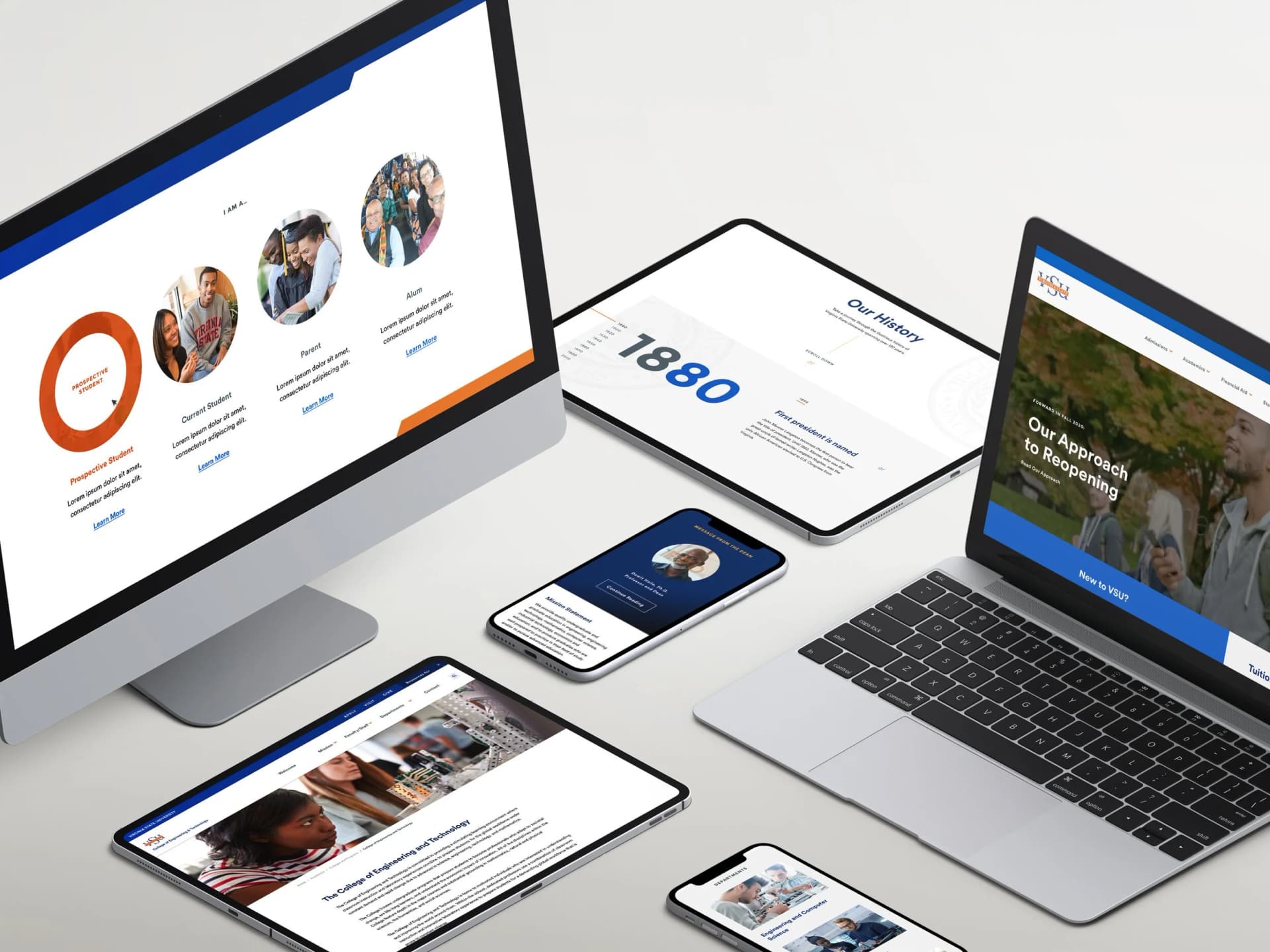
Virginia State University
A digital remodeling of an HBCU
Executive Summary
Brand
Virginia State University
role
UX Lead
The Project
As the UX Lead on this engagement, I directed the end-to-end research and design strategy while partnering with a UX Architect to execute discovery efforts. I established the wireframing approach, led client-facing presentations to secure stakeholder alignment, and oversaw moderated usability testing on our final prototype. I defined our tooling strategy (Sketch, Craft, InVision) based on project needs and team capabilities, and adapted our research methodology to remote collaboration using WebEx screen-sharing—ensuring continuity and quality despite the constraints of a fully distributed team during a challenging period.
Strategic Context
Virginia State University holds a distinguished legacy as one of the nation's longest-running HBCUs, competing digitally alongside institutions like Howard University. However, in 2020, VSU's web presence reflected a 2009-era experience—functional but severely outdated. Users were consistently lost in deep, labyrinthine menu structures. Bounce rates were alarmingly high, and critical information remained buried beneath layers of navigation that seemed designed to frustrate rather than guide.
The Opportunity
Modernize VSU's digital ecosystem to better serve its diverse audience while reinforcing the university's brand equity and competitive positioning in a crowded higher education landscape. Beyond usability, we needed to create an experience that captured the spirit of campus life—something prospective students and proud alumni could connect with emotionally.
Discovery & Research Strategy
I led our research approach by first identifying key assumptions about our user base—current students, prospective students, parents, alumni, and faculty/staff—then validating those assumptions through targeted surveys designed to surface both behavioral patterns and emotional pain points. This hypothesis-driven methodology allowed us to move quickly while maintaining the rigor necessary to confidently inform design decisions.
My focus was ensuring our team captured not just what users struggled with, but why—enabling us to design solutions that addressed root causes rather than surface-level symptoms. We crafted survey scripts carefully to avoid leading questions and structured our analysis to identify patterns across user groups while preserving the nuances unique to each persona. This balance between efficiency and depth proved critical as we moved into synthesis.
Persona Development & Synthesis
I synthesized survey findings into five distinct personas, each with unique priorities but unified by a core need: finding information efficiently. Current students needed quick access to academic resources and campus services. Prospective students sought program information and a feel for campus culture. Parents wanted reassurance and clear paths to financial and safety information. Alumni looked for ways to stay connected and give back. Faculty and staff needed streamlined access to internal tools and departmental resources.
Rather than treating personas as static deliverables destined for a forgotten slide deck, I used them as strategic tools to guide design decisions and facilitate stakeholder conversations throughout the engagement. This ensured alignment across the team and gave the client a clear lens through which to evaluate our recommendations. When debates arose about navigation priorities or content hierarchy, we could return to these personas and ask: "Who are we solving for here, and what do they actually need?"
Design Direction & Information Architecture
Given the scope—100+ pages across six primary navigation trees with numerous sub-navigation structures—I made a strategic decision to establish scalable page templates rather than designing individual pages. This approach:
Maximized efficiency for our team by reducing redundant design work
Ensured consistency across the ecosystem so users wouldn't have to relearn patterns as they moved through the site
Provided the client with a sustainable framework for future content additions without requiring ongoing design support
Key architectural decisions I drove:
Mega-navigation structure — Simplified wayfinding by reducing cognitive load while accommodating complex content hierarchies. Users could see the full landscape of options at a glance rather than drilling through multiple levels blindly. This required careful information architecture work to ensure categories were intuitive and mutually exclusive.
Global utility header — Prioritized quick-access links addressing ~80% of homepage traffic intent, reducing friction for all personas. Through our research, we identified that the vast majority of return visitors came to the site for a handful of specific tasks—checking email, accessing portals, finding contact information. By elevating these links, we essentially gave most users a one-click solution and freed the rest of the homepage to serve broader storytelling and discovery goals.
College-specific navigation instances — Solved for the tension between university-wide consistency and college-level autonomy. Each college within VSU maintained its own programs, faculty, and resources that required dedicated navigation. Rather than forcing everything into one monolithic structure or creating completely separate experiences, I designed a system where each college had its own contextual navigation while users could seamlessly return to the parent structure via the VSU logo. This preserved brand cohesion while respecting the distinct identity of each academic unit. This solution tested exceptionally well with users, who found the transition natural and intuitive.
Validation & Iteration
I oversaw our usability testing program, ensuring we captured feedback across all persona groups to avoid blind spots that come from testing with a narrow audience. My partner and I collaborated on moderated sessions using the interactive prototype I directed, taking turns facilitating while the other captured notes and observations.
Key outcomes:
Users consistently praised the clarity of information architecture, with multiple participants noting how "clean" and "logical" the structure felt
Navigation patterns tested as intuitive across all audience segments—a critical validation given how different a prospective student's mental model might be from a faculty member's
Feedback surfaced minor visual refinements—color contrast adjustments, button sizing tweaks—but no structural changes required
This validated our strategic approach and significantly de-risked the engagement for the client. We could move into development confident that we weren't building something that would require major rework once real users got their hands on it.
Stakeholder Management & Client Engagement
One of the more nuanced challenges was client engagement. Early sprint reviews were met with near-silence, making it difficult to gauge alignment or surface concerns before they became larger issues. Without feedback, we risked building momentum in the wrong direction.
I addressed this by:
Preparing targeted discussion prompts for each presentation—specific questions that required more than a yes/no response
Creating space for dialogue rather than one-way presentations, pausing frequently and explicitly inviting reactions
Building rapport with key stakeholders over time through informal check-ins and demonstrating responsiveness to their constraints
Framing options as tradeoffs rather than recommendations, which invited stakeholders to weigh in on priorities
By the project's final phase, we had transformed the dynamic—stakeholders arrived prepared with feedback and questions, enabling richer collaboration and stronger outcomes. This shift didn't happen overnight, but the investment paid dividends in final alignment and client satisfaction.
Accessibility & Compliance
This was my third engagement involving 508 accessibility compliance, but the first in higher education. Government projects had taught me the technical requirements, but this context demanded a different sensibility. I ensured our team understood the nuances of applying accessibility standards in an environment where emotional connection and campus atmosphere were as important as information delivery.
We couldn't sacrifice the vibrancy and energy that makes a university feel alive just to check compliance boxes. Instead, we found creative solutions—rich imagery with meaningful alt text, video content with proper captions, interactive elements that remained fully keyboard-navigable. We balanced compliance requirements with an experience that made users feel part of something bigger than a website.
Impact & Reflection
This project reinforced a core leadership principle: design strategy must serve both user needs and business objectives. By establishing scalable systems, driving cross-functional alignment, and adapting our process to stakeholder dynamics, we delivered an experience that positioned VSU competitively while honoring its legacy as a historic institution.
The transformation was significant—from a dated, frustrating maze to a modern, intuitive platform that served its diverse audiences effectively. More importantly, we gave VSU a foundation they could build on, not a static deliverable that would age out in a few years.
Key leadership takeaways:
Strategic template systems outperform page-by-page design at scale—the upfront investment in architecture pays compounding dividends
Proactive stakeholder engagement is as critical as design quality—great work means nothing if the client doesn't understand or trust it
Accessibility is a design opportunity, not just a compliance checkbox—constraints breed creativity when approached with the right mindset