USPIS.gov
Giving digital life to the oldest police force in America.
Executive Summary
Brand
The united states postal inspection service
Role
UX Lead
The Project
I owned the complete UX strategy for this digital relaunch, partnering with strategists and creatives to develop concepts, content hierarchy, wireframes, and detailed annotations. I served as the primary liaison between our internal development team and the client throughout the six-month engagement, ensuring design intent translated into the final product. This project was nominated for a 2020 Effie Award.
The Challenge
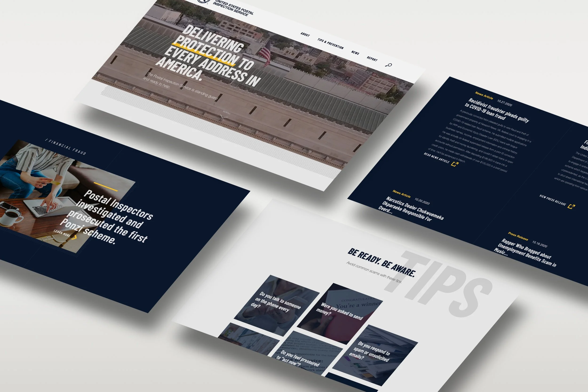
The United States Postal Inspection Service is the oldest law enforcement agency in America—but its digital presence told a different story. Analytics and user research revealed a troubling reality: visitors assumed the site was fraudulent. The outdated design and poor user experience led people to believe they'd landed on a phishing scam rather than a legitimate federal agency.
This wasn't just a branding problem. USPIS relies on public crime reports to generate investigative leads. Their jurisdiction extends far beyond mail theft—covering fraud, narcotics trafficking, and scams that span physical and digital channels. If users don't trust the website, they don't report crimes. If they don't report crimes, investigations stall.
The stakes were clear: rebuild trust, modernize the experience, and make crime reporting feel safe and intuitive.
Strategic Foundation
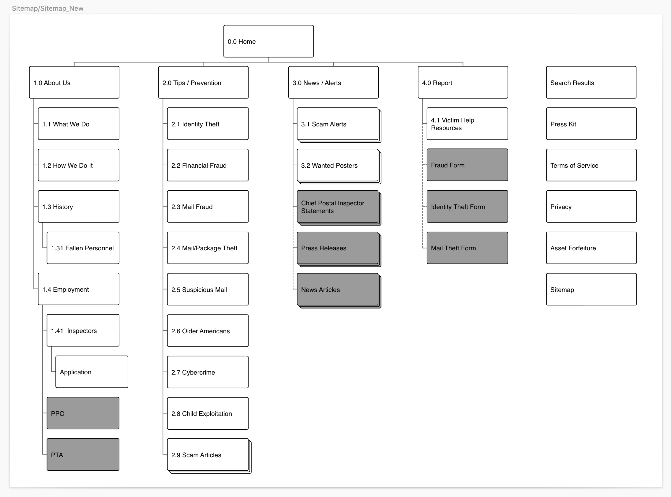
Before any design work, I collaborated with strategists to rebuild the site architecture from the ground up. We mapped the full scope of what USPIS needed to communicate—organizational history, current capabilities, career opportunities, public resources—and identified what mattered most: the crime reporting function.
Everything else would support that core action. Users needed to trust the "Report" button enough to click it and complete the process.
We developed user flows that prioritized clarity and confidence. The reporting experience had to feel official without feeling intimidating. It needed to gather the right information without overwhelming users who might already be anxious about the crime they'd experienced. And it needed to route reports efficiently so inspectors could act quickly.

Design Execution
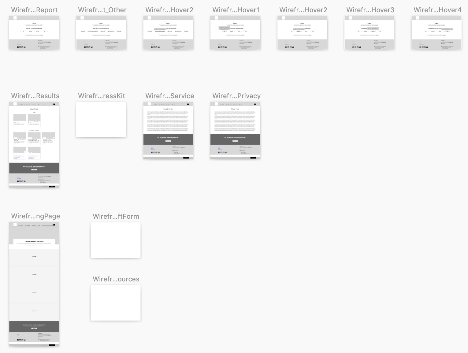
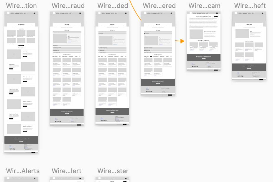
I translated our strategic framework into wireframes and interactive prototypes, building a reporting flow that broke the process into clear, manageable steps. Users could identify the crime type, provide relevant details, and submit—without unnecessary friction or confusing branching logic.
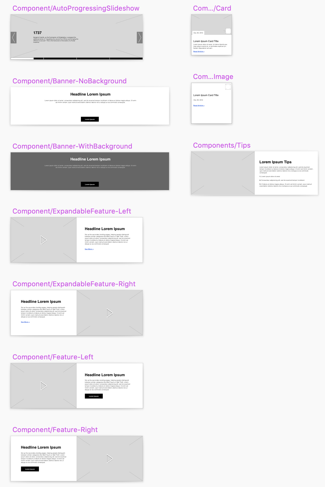
The modular approach I established extended across the entire site. Rather than rigid page templates, I designed flexible content blocks that USPIS could reconfigure as their needs evolved. This gave the agency long-term autonomy—they could update messaging, add resources, and respond to emerging threats without requiring a full redesign.

Navigating Constraints
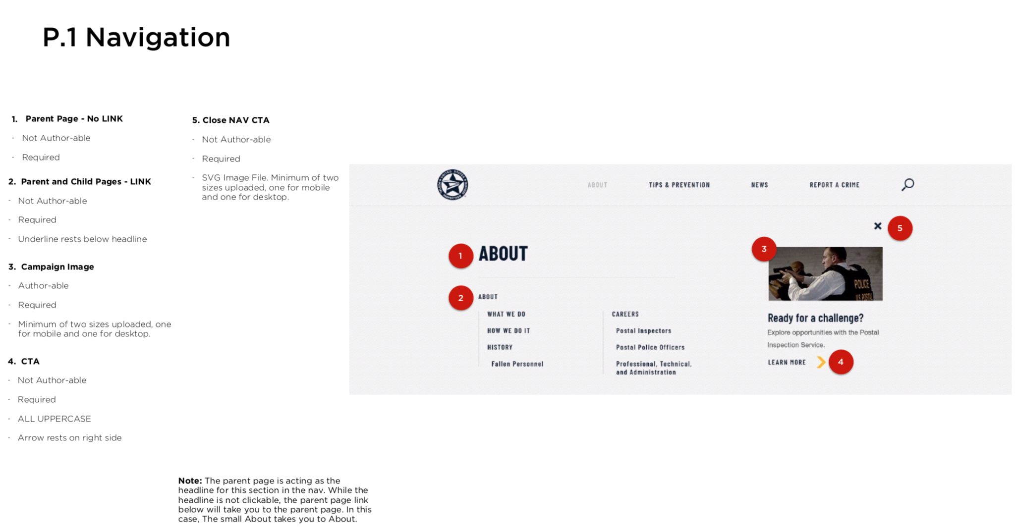
Government projects come with non-negotiable requirements, and 508 accessibility compliance shaped every decision. But I approached these constraints as creative parameters rather than limitations.
Where others might default to safe, utilitarian design, I found opportunities to add polish—leveraging hover states, interaction feedback, and visual hierarchy to create an experience that felt modern and trustworthy while meeting every guideline. The result challenged assumptions about what government websites can look like.
Working within these constraints required close partnership with the creative team. This project became a model for breaking down silos between UX and visual design at the agency—demonstrating that compliance and craft aren't mutually exclusive when teams collaborate early and often.

Development Partnership
Design doesn't end at handoff. I produced comprehensive annotations for every screen and worked directly with developers throughout implementation. When questions arose about interaction details or edge cases, I was available to clarify intent and make real-time decisions that kept the build on track.
This close partnership ensured the launched product matched our vision—not a diluted approximation, but the experience we designed.
Outcomes
The numbers told the story:
Before relaunch: Less than 10% of users trusted the site enough to submit a crime report. The agency's primary lead-generation mechanism was functionally broken.
After relaunch: Over 80% of site traffic resulted in a submitted crime report—covering everything from mail theft to narcotics trafficking.
Beyond metrics, the site transformed USPIS's public perception. It became one of the most polished government websites in operation, reinforcing the agency's credibility and giving them the digital presence their 200+ year history deserved. Recruitment improved. Public engagement increased. The Effie nomination validated what we'd built.

Reflection
This project marked a turning point in how I approach design ownership. As the sole UX practitioner on a high-visibility, high-stakes engagement, I learned that leadership isn't about having a team beneath you—it's about taking full accountability for outcomes and building the partnerships necessary to deliver them.
The cross-functional collaboration with strategists, creatives, and developers established a blueprint I've carried forward: bring UX into creative conversations early, maintain hands-on involvement through development, and treat constraints as opportunities to demonstrate what's possible rather than excuses for mediocrity.
Most importantly, this project reinforced that design has real consequences. A federal agency's ability to protect the public depended, in part, on whether users trusted a button enough to click it. That's the kind of impact that makes this work matter.
Process Artifacts
Below is a collection of screenshots from my process, including Sketch files and annotation documentation from this engagement.